Visuals for Reception Design Ideas
Fusion have presented ideas for reception design in a public facing building. The scheme doesn’t have a conventional reception desk, instead ‘concierge’ desks stand as a waypoint to allow visitors to be directed swiftly to points within the space. Contact us for more info.

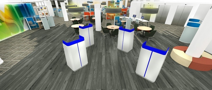
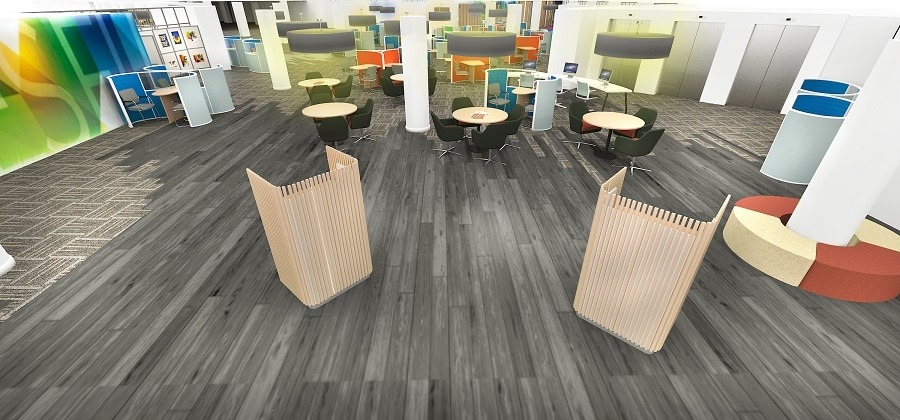
Reception design ideas usually start with a desk, but doesn’t have to. High-traffic reception areas may work better with a setup where bottlenecks are avoided. The visuals for this reception design show two notably different styles. The softened appearance using timber cladding makes the desks less imposing. The second reception design ideas visual uses a more contemporary style for the concierge desks. The harder material seems to lend a degree of authority and makes the desks more ‘stern’. For this reception design scheme the two visuals offer the client a chance to evaluate the tone they want to project as a first impression.

Contrasting Reception Design
As well as changing the appearance, a different finish has an impact on the space further into the building. The softened front desk design style helps the backdrop to stand out more compared to the white desks, which are more of a focal point. Presenting reception design ideas using rendered visuals is a great way to capture initial design strands before committing to a scheme.
Flooring in this reception design is a mix of vinyl planks and carpet both using tones of grey. The visuals show how brightly coloured furniture really stand out on a grey floor, which is the intended design effect, using colour as a way finder.
For more reception design ideas click here to see a range of completed reception design schemes.